A Beginner’s Guide to Brand Identity: Logo, Wordmark & Typography, All In One Place
Brand identity is a powerful psychological tool, not just aesthetics, that quietly builds trust and familiarity. Learn how strategic use of logos, colors, wordmarks, and typography can make your independent brand feel trustworthy from day one.
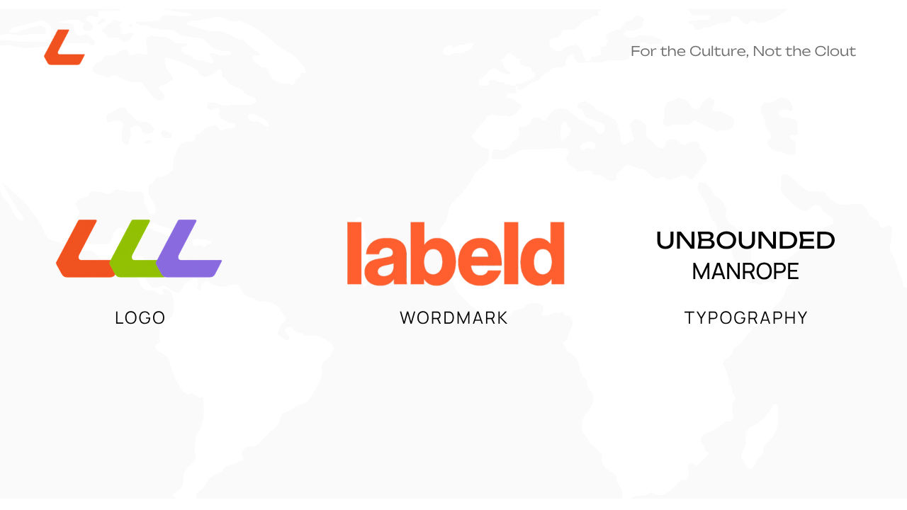
If you're new here, Hi, welcome. We're genuinely glad you found us.
This is Labeld: a platform built for brands who refuse to blend in, and today, Labeld's here to help you stand out a little more too.
Let's start with something people love to underestimate: Brand identity. It isn't decoration, It's psychology. It's the thing quietly deciding, in someone's head, whether you're worth trusting. Let's get into it shall we?
YOUR LOGO
Here’s what most beginners get backwards: they treat logos as the fun part you don’t take seriously because the “real work” is the product. Wrong order, and there’s actual science behind why. Humans make snap judgments off almost nothing, a split-second read researchers call “thin-slicing”. After this judgement, they spend the rest of the interaction unconsciously hunting for evidence to confirm what they already decided. That’s called confirmation bias, and it’s working on your customer whether you design for it or not. A clean, consistent brand doesn’t just look nice, It conveys trust before anyone reads your first product name, and every good thing they notice afterward gets filed under “yeah, this brand is legit.”There’s a second effect quietly doing work here too: the mere exposure effect. The more consistently someone sees the same mark, the same color, the same font, the more they trust it, not because it’s objectively better, just because it’s familiar. Familiarity gets misread by the brain as safety. That’s the actual reason repetition beats novelty when you’re building something new. So, your logo isn’t precious, it’s a repeated signal.
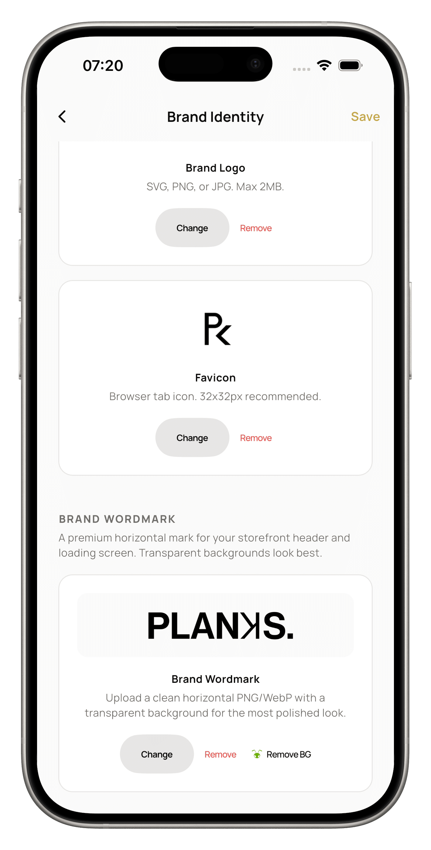
Even a rough one, made by Canva at midnight counts, as long as it shows up everywhere; header, checkout, receipts, products, all of it. You need a good logo, and you need to stay consistent with it. We're not here to teach you how to design your logo; that's your territory, creative genius. We're here for what happens after the logo.
On Labeld, your logo threads through your storefront automatically, so the consistency the mere exposure effect needs happens without you manually rebuilding it on every page. That’s the quiet advantage of doing this on a platform instead of stitching it together yourself.
One more tip from us, test your logo small before you trust it big. This is about legibility at scale. A mark that looks sharp as a huge banner may not look good at icon size, and big brands keep their logos almost boringly simple for exactly this reason: simplicity survives shrinking, complexity doesn’t.
YOUR COLOURS
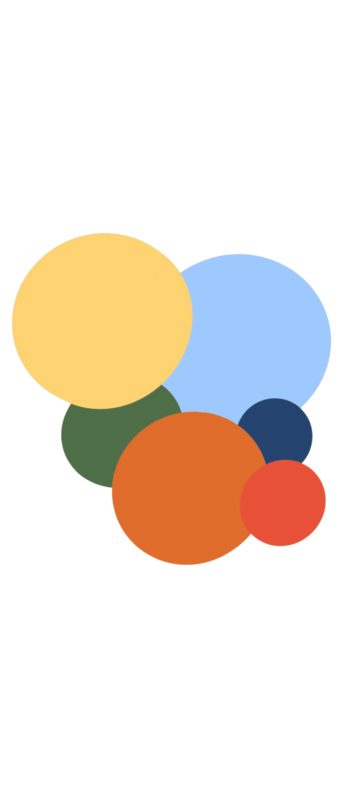
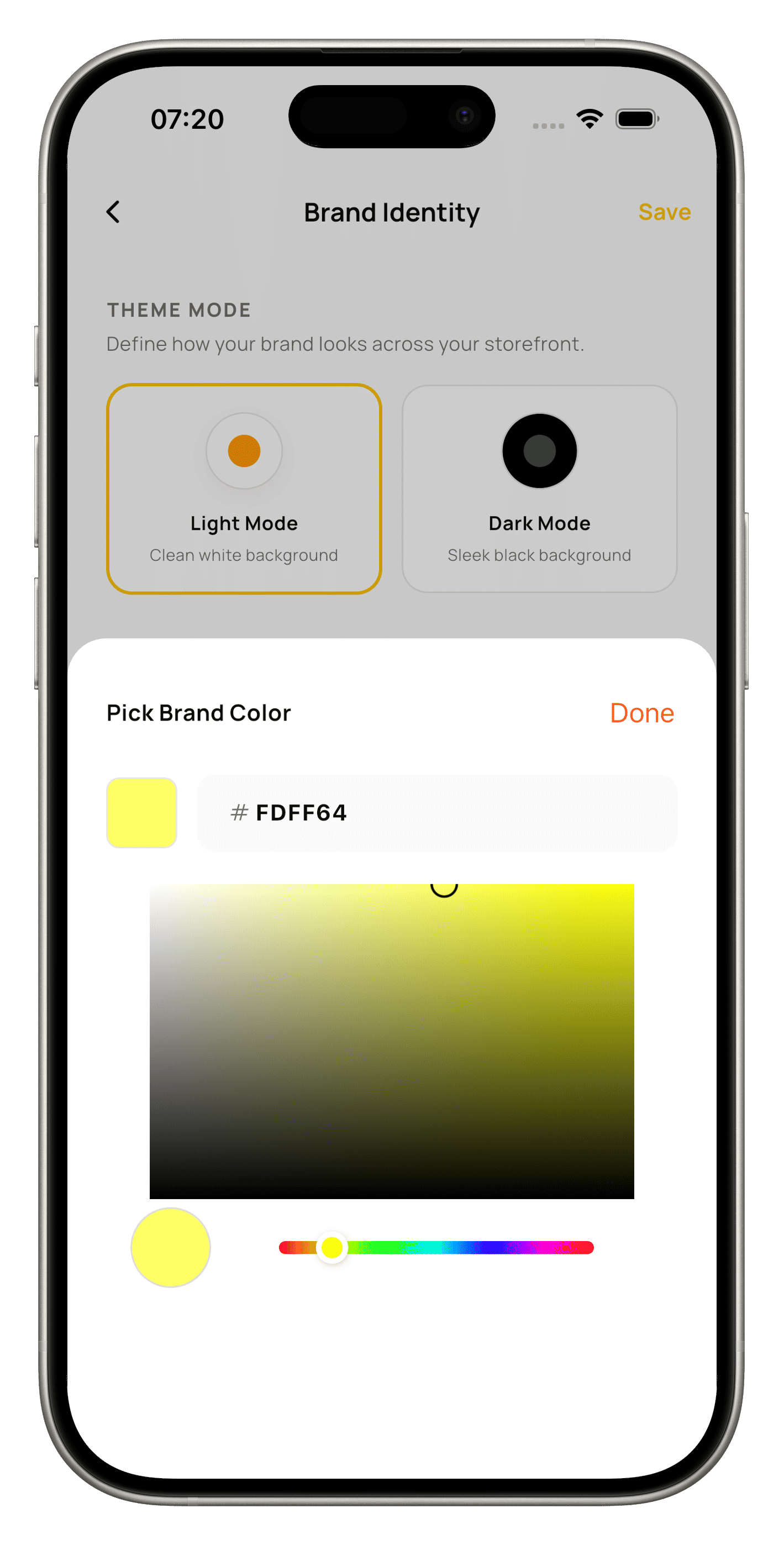
Don’t pick your brand color off a mood board. Pull it from your actual product photography. Whichever holds the strongest, most consistent color already, then repeat it everywhere. Why does a color from your own product beat one you just liked? Because it feels native instead of layered on. Color carries meaning before language does. Warm tones read as energetic and urgent, cool tones read as calm and premium, before a customer even processed what you sell. That’s color psychology working underneath conscious thought. Repetition is what locks it in. Coca-Cola didn’t win red through creativity, it won it through relentless, boring consistency. Labeld pulls your primary color through your storefront, checkout, and buttons in one setting, so that repetition happens automatically instead of you manually re-picking a color on every screen and slowly drifting off-brand.
A WORDMARK
If you don't have a logo yet, a wordmark is the next best thing. Some of the biggest brands in the world never bothered with a symbol at all. A wordmark or logotype is a text-only logo that uses the stylized name of a company, brand, or product as the entire design. The psychology here is called the halo effect: one thing done with visible intention makes people assume everything else was done with the same care, even before they’ve checked. Confidence in one place quietly covers for gaps everywhere else.
TYPOGRAPHY
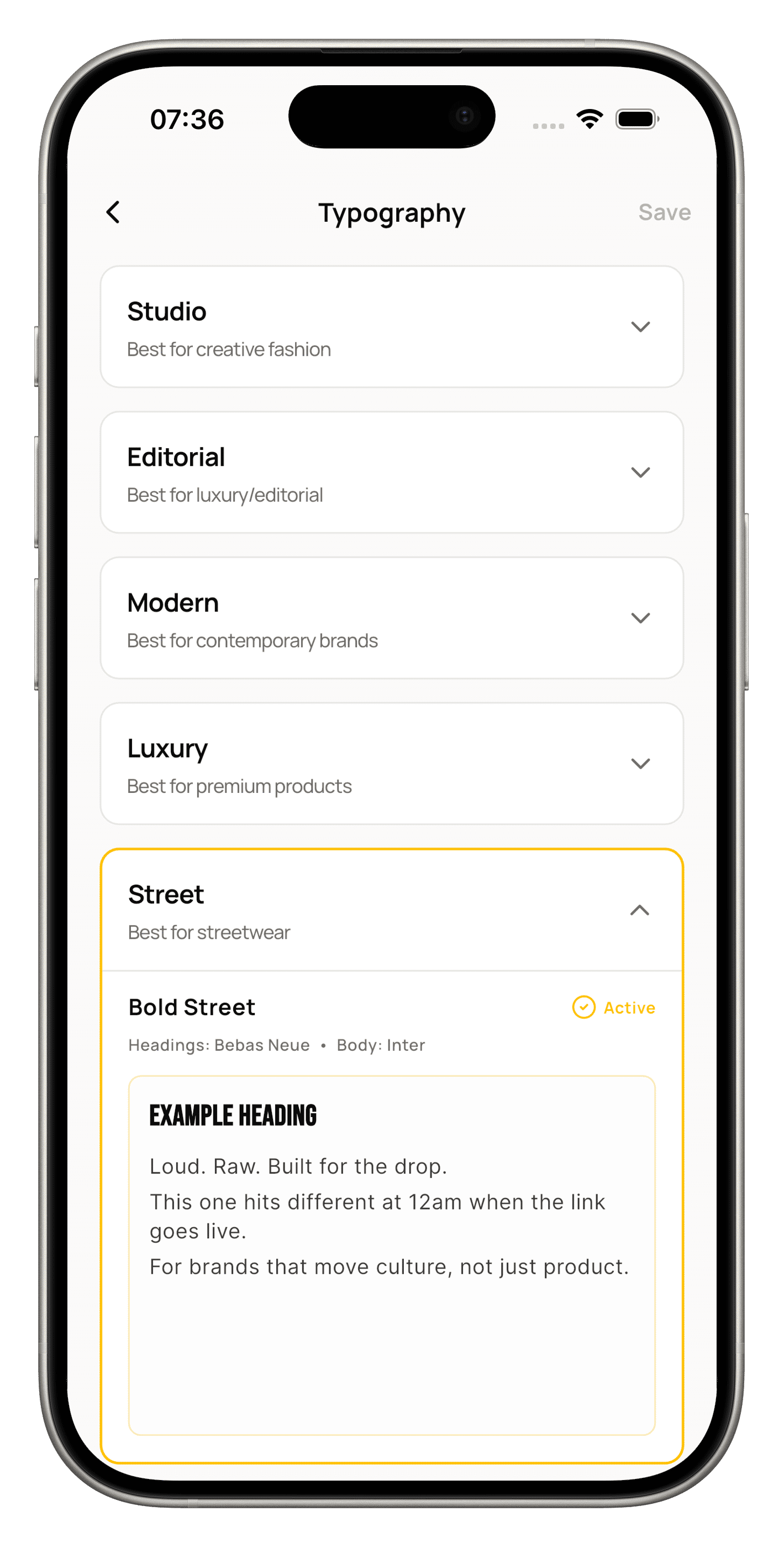
One display font for your name and headers, one body font for everything else. The urge to reach for a third because you want to feel “unique” almost always backfires. Fonts that don’t share a visual logic compete instead of cooperating, and the eye reads that competition as chaos, not creativity. There’s a term for the opposite of that feeling: cognitive fluency, how easy something is for the brain to process. Fluent design feels trustworthy and effortful, even if the customer couldn’t tell you why. Labeld’s font pairing is built around this; a display and body option that are already chosen to sit together, so fluency comes standard instead of being something you have to engineer yourself.
DOES IT DO WELL IN THE LIGHT AND IN THE DARK?
Lastly, check yourself in the dark. Literally.
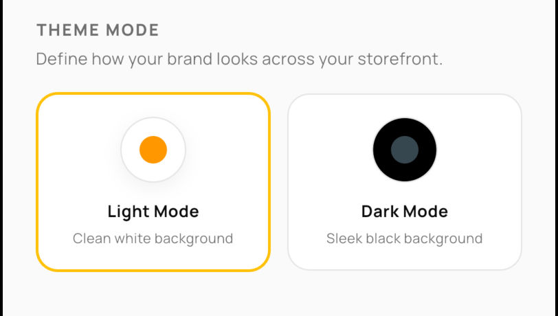
Preview everything in light mode and dark mode both. A color sharp on white can nearly vanish on black. This connects to something called contrast ratio, a real, measurable number designers use, and low contrast is one of the top reasons people quietly bounce off a page without knowing why. It’s not a nitpick, It’s the difference between someone reading your product and someone leaving before they do. Labeld’s storefront preview lets you flip between both modes before you ever go live, so you catch it before a customer does.
Do these five things properly, you’re running a brand that already feels trustworthy psychologically, not just visually before anyone clicks a single product. Choose wisely. Choose Labeld.
The newsletter for
brand builders.
Guides, drops, and dispatches from Labeld — in your inbox, no noise.
Start your brand
for the culture.
Launch drops, manage events, and run your storefront from one place with Labeld Studio.
Get started